
So over the past few weeks we have been studying the art of colour palettes. Therefore, we were set the task during our seminars to develop an image capturing a certain narrative which would be filled with a range of colours based on our selected theme. The choices of themes we were given were the following: Bright's, Neutrals, Complex or Pastels, so there was quite a lot of scope for each. As a group, we chose to do neutral colours, which then after lots of discussion lead us to the colour theme of Monochrome aka black and white but as we found, can also include grey tones to. Being a person whose wardrobe is 80% black and 20% colour, you can imagine this would be the perfect theme for me! Especially when it came to doing research on styling for monochrome.
However, rather than initially going down the road of the serious, classic and minimal look that monochrome can normally be perceived as. Or the edgy, modern, grunge look that as followers of fashion, we have seen numerous time before and are simply quite bored of this recurring trend. Who wants to see yet another sleeveless biker jacket, paired with a white Tee and ripped jeans. Not me. Instead, we wanted to do something a little bit different and really show that black and white can be playful, energetic and fun, by developing an idea with an ironic twist to it. Even if they are not exactly the most vibrant hues to choose from.
To me black and white is far from boring. Together, the contrast is so severe that it almost creates an energy and a statement that other colours such as red, blue or green cannot achieve, especially within garments and attire. Although they are neither primary colours or some may argue cannot even be classified as colours, they complement each one and other extremely well and monochrome, in terms of outfits, is one that not many people can say they have not worn.
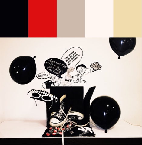
As a group, we wanted to showcase a narrative of the 1960's, a time when monochrome was really soaring in the fashion market but rather than creating imagery of the demands of Mary Quants geometric apparels for women, we decided to embed other significant aspects of the 60's, to portray an image of a variety of elements that had social impact and were among society during this era. (Whilst still showing a graphic side to monochrome.) These elements are also the interests and actions/habits people had at this time, especially the youth and those which have been carried on today in the 21st century. Our colour project was mainly based on the interests of the youth during the 1960's, a time when culture was becoming more diverse, a boom in sub cultures and experimentation was occurring and society was becoming freer, both socially and politically. We included items such as converse and sweets to signify that the image was based on a younger generation, one that these items would most likely be associated with. However, we also included images of popular and favoured cartoon characters that were heavily promoted by new technologies such as television and media during the mid-20th century (although theatrically and comically they had been created earlier) but instead of portraying them as their usual design, we created an irony with these cartoon characters by deliberately showing them being quite out of character! For example, we presented them to be swearing and smoking. These actions both being ones that are seen as socially unacceptable in society. However, the 60's was a time when people were rebelling against the traditions and the examples past generations had set. Therefore, by showing these characters in a different light, it reflects the social change within society, the development and exploration of new identities.
If I were to change anything about this colour story project, I would possibly rethink our choice of monochrome. I feel this way because by narrowing our range of colours down to black and white, it did not leave much scope to experiment with different shades and tones that you could find within brights, pastels or complex colours. Although as a colour theme, monochrome can be both exaggerated and bold in terms of graphics, it did not really allow us as a group to go into depth with colours that were more flamboyant and exciting such as summer seasonal tones or deep, warm autumnal shades. Either of these examples may have possibly provides us with a stronger narrative for our final outcome rather than one that was overly complicated. However, I still liked our concept because we managed to take black and white and show it as playful, fun and comical rather than it being such a serious set of colours that lacked a sense of emotion and positivity.
Here is a look at our final image of 'Ironic Monochrome'. There is also a colour palette attached to the image so viewers can receive a clearer vision of the colours we used for the project to develop our narrative. As you can see we included red tones to reflect the rebellion of tradition and cultural values in the 60's.
Colour Story Project- Ironic Monochrome
No comments
Post a Comment