Trending

Friday, 16 October 2015

That 70's Show (2015 trend)

The 70s- a time where society was indulged in bold colours and patterns, women were rocking platform heels and wedges, hippies were embracing bohemian trends through fringe and lace, and of course, a phase we can't forget, the creation of bell-bottom trousers, aka flares. The flares phase was one which can either be categorized as disastrous or to have completely changed the way we look at the structure and lining of trousers today.
 If there's one thing for sure, the 70's is a decade of fashion that brands love to regurgitate onto the runway, in order to merge past trends into a modern day style.

 The 70's saw style icons such as Jane Birkin influence bold statement pieces. For instance, the craze of denim jeans and hot pants burst onto the fashion scene, making the material cool through celebrity encouragement and press coverage. Also, Jimi Hendrix's continuous promotion of the 'Flower Child' saw the star flaunt tie dye designs and floral print jackets during his concerts and around popular celebrity events, primarily experimenting with colour to embrace the new face of rock and roll. In his book 'Fashion a Philosophy', Lars Svendsen's even makes comment in his chapter 'Fashion and Language' stating that "in earlier societies, dress codes were relatively stable". However, the 70's saw a boom of painterly fashion following on from the expressive and liberal movement of the 60's, in awe of post-modernism and allowing real subcultures to move forward, especially in regards to women's culture and fashion.

Examples of 70's fashion:


Therefore, as I looked further into the trend, I was then set the task on my university course to develop a Pinterest board based on 'trend awareness', which would be completely devoted to the 1970's era. The 1970's decade was the narrative, filled with different motifs and fashion garments such as the ones I have included at the beginning of my post. I also wanted to demonstrate how this trend has influenced today's market in terms of designer labels and High Street brands. Fortunately, this is currently proving to be quite a hit amongst Spring/Summer 2016 fashion, which has been frequently photographed and promoted during the recent Ready to Wear collection at 2015's Fashion Weeks in London, Paris, Milan and New York.

Here is few examples of my findings, which were taken from Pinterest, various blogs and online social mediums for certain brands which have been influenced by the 70's fashion vibe in the past year.

Starting with 1970's inspired fashions for 2015:
In 2015 designers took a step back in time, to a one filled with burgundy's, caramels, deep blues and oranges. Designers such as Prada, Louis Vuitton, Chloe and Yves Saint Laurent took on the 70's inspired look for their catwalk shows.

Harper's Bazaar magazine categorized these looks as the 'Nixon Era'.


Chloe Spring 2015 Runway


Prada Spring 15 Runway


Louis Vuitton Spring 2015 Runway


Saint Lauren Spring 2015 Runway


As we move into 2016 in a few months, although it is far from avant-garde, designers have maintained the same sort of theme within their collections.
Is this too much repetition of fashion or is the industry just nostalgic over past trends and wanting to develop the iconic look even further? Lars Svendsen (Fashion a Philosophy) goes on to sum up this question by stating that 'Like art, fashion has become ever more self-referential. It is created by previous fashions that can be affirmed or made fun of" therefore, risks and experiments are taken but industry still continues to recirculates.

Jil Sander SS 16 Campaign


Prada Resort SS 16 Runway


MSGM SS 16 Campaign
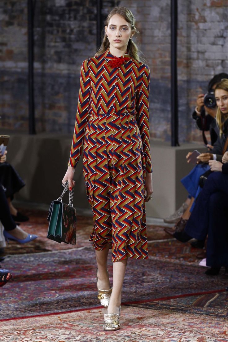

Gucci SS 16 Runway

Although high end fashions and premium brands seem to be portraying this style extremely well, it cannot go unnoticed that this trend is also featuring in and amongst high street labels, especially Topshop and Zara

Topshop Unique AW15 editorial 


Topshop Unique AW15 runway


Zara's Current AW Collection


Zara's Current AW collection

                              
                                                   Zara's Current A/W Collection

It can be seen that this trend has been recycled on the runway from SS 2015, right through to the upcoming SS 2016 range, for both high street and high end fashion. Predictably, this style is not planning on going out of season any time soon. Therefore, this is the perfect opportunity to hunt out them old stripy turtle-necks and denim dungarees to complete your look this fall.

A little something extra:
Here are a few editorials based on 70s chic fashion that I came across while reading the Volume 2 Autumn/Winter 2015 edition AnOther Magazine. Take a look and get inspired even more!

Article- Shine Bright like a Diamond (Shine Bright)
Photographer: Benjamin Alexander Huseby
Styling: Katie Shillingford


SHARE:

Tuesday, 13 October 2015

What am i reading? - Dazed and Confused


"In order to be irreplaceable one must always be different." —Coco Chanel

Hi, so I thought for this post I would talk a little bit more about what kind of magazines and books I am into! As you can see, I started my post with a quote from possibly one of the most iconic fashion designers of all time, Coco Chanel. Although this quote can be interpreted in different ways in terms of fashion, I have used this quote to talk about one of my favourite independent magazines for fashion, culture, photography and music- Dazed and Confused. I chose this quote because I truly feel Dazed and Confused offers something so much different to other top fashion magazines on the market, such as Vogue, Harper's Bazaar or even Love Magazine which visually, has similarities to Dazed, but lacks in content.

Dazed channels both Britart and Britpop in today's society to revamp the vision of Youth Culture, whilst also looking at certain trends which do not necessarily signify high fashion, but show a more quirky, eccentric and out of the ordinary respond to today's attire and fashion culture. However, I am not saying that Dazed should not include news on designer fashion because what magazine would not discuss topics such as 'what models are reaching super status', 'who is being employed as Balengiaca's new creative director', 'fashion week's ready to wear' or the lead up to the Haute Couture's runway debut. Fashion would not be fashion without these elements.

 Anyway, back to my discussion of the qualities of Dazed and Confused. Although I intend to discuss the Autumn/Winter 2015 issue and Dazed's identity as a magazine later in this post, reflecting back to the September issue, I particularly admired a certain shoot Dazed did called "The New Aesthetic". You will learn, as I go into more detail, that it perfectly agrees with the words of the writer of the magazine, Jefferson Heck, who claimed "the magazine is not a conspiracy to force opinion into the subconscious of stylish young people."
The fashion shoot saw photographer Roe Ethridge ironically photograph naturally beautiful models of today, but instead of showing off their generic beauty, he pictured and characterized the girls, with the help of makeup artist Yadim, as females who were likely to be described as odd, unusual or labelled ugly. Suggestively, he did this in attempt to reform the outlook society has on beauty and the egotistical judgements people make.
What I really liked about the piece was that in the attached article to the photo shoot, the writer, Janelle Okwodu, purposely included Montero's captivating statement that for him "beauty is being you. It's the way you carry yourself and how you treat others." Communicating to those who lack self-esteem, that it is in fact in trend to be yourself and different from the crowd.

Here is a look at some of the photographs I picked out from the shoot that I felt carried the theme of 'The New Aesthetic'.

Amilna Estevão wears roll neck dress Salvatore Ferragamo, nose ring Acne Studios

Molly Bair wears bomber jacket 3.1 Phillip Lim, t-shirt American Apparel

Willow Hand wears devore dress Givenchy by Riccardo Tisci, earrings Tada & Toy

Kadri Vahersalu wears dress Dior


I feel as an observer and reader of the magazine, Dazed writers carry this certain theme across each edition. Therefore, I will now come to the piece in this post where I would like to share with you, a couple of things which stood out for me throughout the Autumn/Winter 2015 issue.
Relating back to the theme of Youth Culture, I particularly liked an article by Claire Marie Healy called 'Teenagers in their Bedrooms'. The magazine has used photographs of past generations to resurrect the idea of a bedroom culture (studied by Angela McRobbie) among teenagers and how they pave their identities through interior and style. Also, promoting previous trends from the 80's (a time where online identities and social mediums were no such thing) to influence current readers of today. Arguably, the article represents a certain era but also adds to this ideological cycle of repetitive fashion within the industry, preventing new trends from being born.

Dazed and Confused Autumn/Winter 2015 cover featuring 'Pearl'


Some images from the article-


A few other things I liked about the Autumn/winter issue were the interviews with out of the ordinary icons such as Pearl Liaison (star of Ru Paul's Drag Race), Mia Goth, Arvida Bystrom and Grimes to deliberately promote all different kinds of fashions, whether they be controversial, retro, grunge or even explicit in cases. Therefore, the magazine takes risks and turns them into something weirdly wonderful, bypassing anything which would normally be categorized as a fault.


I also wanted to take the time to sum up what I really thought Dazed magazines objectives were:

Meaning of Dazed and Confused: Maybe the meaning of this magazine is all in the title- DAZED AND CONFUSED. Teenagers in the 21st century want to experiment and try new things causing them to be confused with what society's conformities are. However, this is not something which previous generations have not experienced to. Dazed, in my eyes, revamps the past but still maintains that daring element that fellow contemporaries would condemn. Therefore, I feel Dazed magazine analyses Youth Culture whilst sending out a message to youngsters that it is okay to be different as seen in the photo shoot I particularly picked out from the September Issue.
In my opinion, the magazine is at the height of alternatively, acting as a catalyst for controversy and edgy, unique yet fresh fashions.

In later posts, I plan to also discuss what I found interesting about AnOther Magazine's Autumn/Winter 2015 issue (which was also made by the creators of Dazed) and a new book I purchased this week called '100 Ideas that changed Street Style' linking in with the more edgy and unique look at fashion.

Thank you for reading,

Kate x
SHARE:

Sunday, 11 October 2015

University Pre Arrival Task

Before my big move to Nottingham for university, my course group were set the task of developing a pre-arrival project, based on Fashion communication and Promotion, to complete over the August/September months. The task was set in order to broaden our range of brand knowledge and to start to develop an opinion and perspective which would allow us as students, to understand the fashion industry and how things are printed, visually merchandised and digitally promoted.

The task brief was-
Identify examples of what you feel are some of the best Fashion Communication and Promotion touch points. Who, in your opinion, is translating, projecting or exploring fashion codes and messages in an innovative and exciting way?

What are you reading, watching or following? Keep in mind emerging technologies, new platform hybrids and social networking advancements. We are interested in your perspective, introduce us to your current preoccupations and fashion favourites!

Select, print, photograph or collect the following:
  • three digital examples (blogs, websites, twitter feeds, online marketing etc.)
  • three printed examples (magazines, brochures, brandzines, zines, lookbooks, flyers etc.)
  • three retail examples (shop windows, visual merchandising, shop interiors, point of sale etc.).  

For anyone planning on studying this course, I hope that you find this post helpful and it gives you some insight into what the task visually consists of. However, although this was my approach to the task, it can be done using PowerPoint, a blog or creating it poster form. There are so many alternatives! Don't worry though, the task is not something to stress or lose sleep over. Everyone was really laid back about it and I actually found it really fun to do!

Here is a few photographs of the examples I created in response to the brief.

Retail Examples:


 Burberry's Regent Street Flagship Store interior and display

Burberry's collaboration with Printemps in Paris for their Christmas window display.

Dolce and Gabbana's Window Display spring 2015

Dolce and Gabbana's runway show 'Viva La Mamma' AW 15

Urban Outfitters Window Display and Store Interior

Printed Examples:

Harper's Bazaar Magazine September Issue '15

Dazed and Confused Magazine September Issue '15

Love Magazine AW '15

Digital Examples:

ASOS Website

ASOS Magazine

Polyvore 


SHARE:

Saturday, 10 October 2015

"Life's face is the skull"

For my third post, I wanted to share something I am deeply interested in, home and interior décor. Although I am a fashion student, I still have a strong passion for unique and out of the ordinary pieces of furniture and home accessories, which I briefly mentioned in my first post. However, these days the fashion world has plummeted so far into different areas of market and design, you could say that interior design holds a very important role within today's fashion industry, just as much as it holds a huge role over my life and mostly over my bank balance!
  Anyway, back to the subject of my post. I have deliberately photographed this weird yet funky little candle I bought around Christmas time from a stall on the outskirts of Camden Market, London. The skull gives off such an eerie vibe as it sits on my bedroom dressing table, whilst also channelling a sense of creativity through the texture and structure. Therefore, revamping the image of candles. In my opinion I love this bizarre little quirky piece! I had never seen anything like it before but from studying art throughout school and college I had always found the skeletal structure and Gothic pieces quite intriguing. Therefore, I knew I had to have one of these in my room at home.
  Also, I thought by buying the pastel pink version it decreased the morbidity of having such a life-like skull watching me as I did my morning make-up.


This is a photograph I also took at the stall when I bought my candle. As you can tell they are all amazingly handmade and the detail which has gone into making each one of them is immense. It was so hard to choose between the colours!


I also purchased my rose gold pocket watch from Camden Market and I bought the Palmistry hand in a vintage shop on Portobello Road, London.
SHARE:
© KATE FERGUSON. All rights reserved.
Blogger Designs by pipdig