Trending

Thursday, 12 November 2015

Colour it- Autumn/Winter 15/16

So now that were getting right into the autumn season and winter is creeping just round the corner, I decided to give you a few colour inspirations for your wardrobe this fall! Surely I am not the only one who feels like they should not be hunting out their winter faux fur coat just yet and should still be sporting a light weight Levi's denim jacket? Where did the summer go?! However, with these Autumn/Winter 2015 seasonal colours that I have chosen, you definitely won't be going too cold this season and instead, you will be painting the town with these rich and beautiful timeless teals, deep cranberries, pigment greens, tangerines, fuchsias and royal blues. Take a look below!

For this post, I have mainly looked into a range of colours for ready to wear designer fashion as a whole, because in most trend cases, garments at designer level always trickle down and inspire high street fashions brand, resulting in a more accessible and affordable look for consumers. However, vice versa, it cannot go unnoticed that high street fashion and recurring street styles can bubble up through the hierarchy of fashion into designer catwalks and collections for ready to wear or resort lines.

I intend to review the high street market's visual merchandising and colour scheme for the Autumn/Winter 2015-16 season in my next post. However, I wanted to concentrate on each market level separately so the differences can be seen clearer. Similarly to looking into the designer ready to wear collections, during my research for the high street colour post, I specifically chose competing brands in the market to review and found that there are more similarities between their products and collections than you would imagine! So keep an eye out for my next post.

Kate x


Autumn/Winter 2015-16 Colour Palette


Pigment green:
 
Dolce & Gabbana - Autumn/Winter 2015-16 Ready-To-Wear - MFW (Vogue.co.uk):  
Dolce and Gabbana                                   Bottega Veneta

  Cédric Charlier Autumn-Winter 2015-2016 (Fall 2015) Ready-to-Wear, shown February 2015
Jil Sander                                                    Cédric Charlier
 
Pantones colour for 2015: Marsala
 
See the Emilio Pucci autumn/winter 2015 collection:
Emilio Pucci (both)
H&M Fall 2015 Ready-to-Wear - Collection - Gallery - Style.com:
H&M (Catwalk Ready to Wear)


Timeless Teal:
 
Gucci Pre-Fall 2015 - Collection - Gallery - Style.com:  
Gucci (both)
 
Balmain                                                       Bottega Veneta
Burberry
 
 
Oranges:
 
Burnt                                                             Tangerine                                    
Gucci TWIN PEAKS The Pre-Fall 2015 Trend Report:  See the Miu Miu autumn/winter 2015 collection:
Gucci                                                            Miu Miu

Fire
Kenzo
 
Apricot Orange                                                                                    
 
Céline                                                              Louis Vuitton

Rusted Orange
 
Bottega Veneta
 
 
Royal Blues                                                                                         
 
Moschino                                                           Gucci
 
Emilio Pucci
 
 
How about a mixture?
 
FASHION VIGNETTE: TRENDS // PATTERNBANK - PARIS FASHION WEEK . A/W 2015/16 PART 1:
Balmain (both)
 
 Gucci                                                           MSGM

MSGM
 
 
Trend Council. Combos de cores para o Inverno .(Seria para o inverno de 2015 nosso, mas como somos sortudas podemos usar as tendências antes):
 

SHARE:

Tuesday, 10 November 2015

The Age of Iris Apfel

"Life is too short to wear boring clothes"- Cushnie et Ochs

We all have our own perspective of what we believe is fashionable, on trend or simply looks good on an individual in terms of garments and attire. I myself as a fashion student have my own critical views and a visual understanding of seasonal fashion trends whether they be megatrends, micro trends or the odd fad that we will see burst onto the fashion scene, then die instantly after heavy promotion and consumer interest. However, in today's fashion industry why should there be so much emphasis on luxury brand new machine made fashions when there is so many other understated hand craft fashion pieces within vintage shops and boutiques that can be accessed. Yes, designers need to keep up with current trends and products to maintain their customer attraction and to differentiate themselves from competitors in the market, but where are those statement pieces gone that look like they have been pulled out of Pandora's Box?

After watching the film documentary 'Iris' I observed that Iris Apfel, a legendary collector of fashion, uses her experience of culture and fashion to offer a retrospective artistic acknowledgement to the fashion industry through vintage apparels, realising that if you hang onto things long enough, they will come back in trend. She also shows an interest in not so typical designer fashions and instead, digs deep into the streets of Harlem to find distinctive and unusual pieces which yes, are in some cases unaffordable but ever so unique. This interest in vintage garments is something that many professionals in the industry neglect as we carry on living in this modern 21st century society, seeing brands debut their new regurgitated machine made garments that have not been created by the directors or designers themselves.
 
Apfel certainly does not lack confidence when she combines cheap and chic garments, usually found or bartered for within markets, thrift stores and jumble sales, to create her own unique style. Her style allows her to still surprises and mesmerizes her followers even as she reaches her nineties. The nineties being an age group stereotypically and socially stigmatised as an era in life associated with failure to care properly and the need of assistance in terms of a person's choices due to the breakdown of memory and ability to do basic things.
Apfel most definitely rejects the ageism that is received by her age group which categorically sees the old becoming a useless demographic time bomb. She does this by using her skills to her full potential and by doing so, she has become such an in demand fashion businesswomen, receiving 50 + phone calls a day from people who want to work with her or receive inspiration for fashion. Therefore, this adrenaline, emotionally allows Apfel to feel nineteen again when she receives her fixation of fashion, forgetting her physical age but also allowing her to use the knowledge and curiosity she has grew up in terms of the interrelations between economical, social and political forces that have influenced fashion over the past century. This knowledge is certainly something that many designers nowadays lack. Apfel agrees with my statement in the documentary as she confidently disapproves of those who try to buy their style by submissively following popular forced trends, rather than using clothes as a self explanatory tool and a means to express their own identity. Apfel's identity is one which is arguably influenced by all different cultural aspects and global regions.


Iris Apfel's proves that her fashion and style is individual and is far from anything categorised as boring and at the age of 94, she demonstrates that one does not have to be in their 20's, buying the most luxury, in demand product within today's market to be the most stylish person around. She continues every day, as she has for the past eight decades, to come up with new innovating and different ways to demonstrate fashion as a montage of art rather than something mediocre and seen on every other fashion icon. She takes classic fashions and gives it her own twist by pairing dinner jackets indulged with fur accessories and bizarre heavy couture costume jewellery to really play with the way she dresses. Therefore she provides an image of both fantasy and glamour for her fans. However, most importantly she connects with her followers to communicate the message that it is better to be happy than to dress well and to her, everything she buys has memories. Therefore, her collection never goes out of season and is classical in a personal way. Her eclectic visionary allows her to demographically draw in fans from all walks of life and social groups such as various classes, genders and ages.

Apfel being filmed with her fans at Loehmann's 

Referring back to the idea of the age of fashion icons, Iris, once named the geriatric starlit for her work, has been photographed in a juxtaposing way for the edgy, youthful magazine Dazed and Confused, proving that in this age obsessed society, you don't have to be young, fresh faced or reaching ten million followers on Instagram to be on the front cover of one of the most popular fashion magazines in the world. This magazine article also indicates that major brands are acknowledging the buying power of women of an older generation and swapping young social media made models for famous women who are 50+ in fashion and beauty campaigns.

Dazed and Confused November 2012: The Art Issue
 Shot by Jeff Bark at Apfel's home in Manhattan and styled by Robbie Spencer in Rei Kawakubo’s 2D Comme Des Garcons collection


M Le Monde Magazine La Fleur de L’age Richard Burbridge - October 2014

Dazed Magazine is not the only one to do this, photographer Richard Burbidge has also photographed women of an older generation for this magazine photo shoot.
                       M Le Monde Magazine La Fleur de L’age Richard Burbridge - October 2014:
M Le Monde Magazine La Fleur de L’age Richard Burbridge - October 2014:


Furthermore, beauty should not be moulded through the use of plastic surgery or the commercialisation of heavy coverage of makeup, it should be a reality. Everyone knows how old you are, regardless of surgery, so why hide it? Iris may not be Kendall Jenner, but who needs to be with a career, legendary status and bizarre dress sense like Apfel herself.
SHARE:

Sunday, 8 November 2015

Colour Project- Ironic Monochrome

Hi! Sorry for my lack of posts in the past few days, I have been super busy with a project for my university course which I am actually going to discuss in this post!
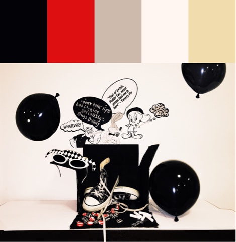
So over the past few weeks we have been studying the art of colour palettes. Therefore, we were set the task during our seminars to develop an image capturing a certain narrative which would be filled with a range of colours based on our selected theme. The choices of themes we were given were the following: Bright's, Neutrals, Complex or Pastels, so there was quite a lot of scope for each. As a group, we chose to do neutral colours, which then after lots of discussion lead us to the colour theme of Monochrome aka black and white but as we found, can also include grey tones to. Being a person whose wardrobe is 80% black and 20% colour, you can imagine this would be the perfect theme for me! Especially when it came to doing research on styling for monochrome.
However, rather than initially going down the road of the serious, classic and minimal look that monochrome can normally be perceived as. Or the edgy, modern, grunge look that as followers of fashion, we have seen numerous time before and are simply quite bored of this recurring trend. Who wants to see yet another sleeveless biker jacket, paired with a white Tee and ripped jeans. Not me. Instead, we wanted to do something a little bit different and really show that black and white can be playful, energetic and fun, by developing an idea with an ironic twist to it. Even if they are not exactly the most vibrant hues to choose from.

To me black and white is far from boring. Together, the contrast is so severe that it almost creates an energy and a statement that other colours such as red, blue or green cannot achieve, especially within garments and attire. Although they are neither primary colours or some may argue cannot even be classified as colours, they complement each one and other extremely well and monochrome, in terms of outfits, is one that not many people can say they have not worn.

As a group, we wanted to showcase a narrative of the 1960's, a time when monochrome was really soaring in the fashion market but rather than creating imagery of the demands of Mary Quants geometric apparels for women, we decided to embed other significant aspects of the 60's, to portray an image of a variety of elements that had social impact and were among society during this era. (Whilst still showing a graphic side to monochrome.) These elements are also the interests and actions/habits people had at this time, especially the youth and those which have been carried on today in the 21st century. Our colour project was mainly based on the interests of the youth during the 1960's, a time when culture was becoming more diverse, a boom in sub cultures and experimentation was occurring and society was becoming freer, both socially and politically. We included items such as converse and sweets to signify that the image was based on a younger generation, one that these items would most likely be associated with. However, we also included images of popular and favoured cartoon characters that were heavily promoted by new technologies such as television and media during the mid-20th century (although theatrically and comically they had been created earlier) but instead of portraying them as their usual design, we created an irony with these cartoon characters by deliberately showing them being quite out of character! For example, we presented them to be swearing and smoking. These actions both being ones that are seen as socially unacceptable in society. However, the 60's was a time when people were rebelling against the traditions and the examples past generations had set.  Therefore, by showing these characters in a different light, it reflects the social change within society, the development and exploration of new identities.

If I were to change anything about this colour story project, I would possibly rethink our choice of monochrome. I feel this way because by narrowing our range of colours down to black and white, it did not leave much scope to experiment with different shades and tones that you could find within brights, pastels or complex colours. Although as a colour theme, monochrome can be both exaggerated and bold in terms of graphics, it did not really allow us as a group to go into depth with colours that were more flamboyant and exciting such as summer seasonal tones or deep, warm autumnal shades. Either of these examples may have possibly provides us with a stronger narrative for our final outcome rather than one that was overly complicated. However, I still liked our concept because we managed to take black and white and show it as playful, fun and comical rather than it being such a serious set of colours that lacked a sense of emotion and positivity.

Here is a look at our final image of 'Ironic Monochrome'. There is also a colour palette attached to the image so viewers can receive a clearer vision of the colours we used for the project to develop our narrative. As you can see we included red tones to reflect the rebellion of tradition and cultural values in the 60's.

Colour Story Project- Ironic Monochrome


SHARE:

Sunday, 1 November 2015

Favourite photo shoots from Autumn/Winter 2015

Hi everyone! So for this post I thought I would share with you my top 3 favourite fashion shoots of the Autumn/Winter season. Some of the shoots I have included, are a mix between editorials and advert campaigns but foremost, they are the ones I have found extremely awe inspiring during this season's fashion. They are also the most liberating fashion photo-shoots I have come across this season in terms of culture, dance & movement, graphics and lighting. A portraiture theme also runs through my choices.
Take a look!

I also intend to carry on blogging about other interesting photo shoots that I come during the rest of the season so keep an eye out!

1)Fashion meets Dance


 Ensemble Pieces Photographed by Patrick Demarchelier, Styled by Lucinda Chambers. Model: Karlie Kloss.


In this series of photographs, photographer Patrick Demarchelier has captured almost a sense of movement within the garments. Kloss interacts with what she is wearing by structuring her movements to allow the clothes to really flare out or crease to release a sense of life beyond her humanity, embodying that life into her outfit. By doing this, a presence flows among the photo and through her movements, subtle shadows and linings have drawn the viewer's eyes towards Kloss' intense silhouette which has been enhanced, against the harsh grey background that slowly brightens as it gets closer to the centre of the image. Due to this feature, Kloss has achieved a dominating presence and hegemony in front of the background.  The use of colours in this shoot is so important. Stylist Lucinda Chambers has especially used a dark complex palette of colours signifying autumnal tones yet a hint of Japanese authenticity to really play on the idea of movement through dance. Arguably, an essence of motions resembling traditional Asian martial arts can also be translated in some of these shots. Though Kloss' expression in the photo might be perceived as quite aggressive reflecting the mannerisms of the sport, It is still quite emotive and artistic in a minimalistic way. Chamber's has also developed a synthaesia through colour to make viewers question what kind of mood the stylist is trying to capture. In my opinion, there is no sadness in this shot mentally, but the mood is created completely through physical elements. Although the colours would suggest that this is a narrative based on misery, instead, it gives off a sense of power, strength and female superiority within the shot which Kloss carries so elegantly.  The image is so dramatic yet without acknowledging the choice of hues, there is also that sense of 1950's rhythm and swing dance portrayed within the artistic piece, expressing that there is a sense of time within the shot, whether it gives off other misleading connotations of culture or not.


2) JAMES CREWE

Photographer: Stylist: Alison Mackie
Model: James Crewe
Okay so a few posts back in my 'what am I reading' post, I said how I was going to share with you, some of my favourite things from volume 2 of AnOther magazine Autumn/Winter 2015 edition. So I have decided to combine it with this post so I could go into detail about a certain photo shoot I found while flicking through the edition of the magazine. This shoot also links to my previous post about trend rebellion and androgyny, portrayed by James Crewe, a previous Central Saint Martin's student. 

The photo shoot sets the scene at Crewe Hall, a Jacobean mansion in Cheshire, where Crewe is centralised in front of the camera, dressed in fantasising haute couture and stood with such elegance and poise. The images connotes such feelings of confidence and presence as Crewe poses as a descendent of the Crew Family, representing the decadence of his upper class families past to communicate a story of their aristocracy and elite status. His porcelain complexion characterises a vision perfection and innocence which is complimented by the soft delicate pastel shades within the gorgeous dresses. As an observer, I am mesmerised by the design of this Alberta Ferretti Limited Edition Spring 2016 dress (seen in the first image) which has been richly decorated with floral garland paintings and embroideries to mirror the narrative of 19th-century renaissance romanticism. The dress also reflects the sublime architecture of the house, especially the gilded wood panelling and Jacobean designs within certain rooms which have also been pictured in later shots.  Stylist Alison Mackie has captured this superbly within her choice of garments to really replicate the tones, structure and elegant interior in the house. Versace, Givenchy, Chanel and Shiaparelli, are all exquisite couture brands worn by Crewe, to vision a series of photographs cherished with hand painted feather patterns on blush organza, crystal embroidery on chiffon and lemon yellow lace to further a theme of wealth and dominance but to still convey purity.

Crewe has represented the idea of sexual ambiguity by combining both masculine and feminine characteristics, as he encapsulates an image of androgynous beauty from the way he has structured himself to have women mannerisms in shots, but he still has the facial and physical features of a man. The image almost communicates a message of Crewe looking over his shoulder in retrospective to when he was child at Crewe Hall. Back to a time when he would dress up in his Grandmother's jewels and dresses to escape his reality of living as a male and become his female alter-ego Luisa Casati. Arguably, this may be influenced by the fact that his grandmother was a model for Max Factor therefore, holding such a strong sense of femininity within the family. However, it is also can be seen that Crewe mixes with both male and female clothing. This can be seen through his wear of 1920's pinstriped suits, a vintage Lanvin silk tie, wool trousers from Contemporary Wardrobes and traditional fair isle jumpers in certain shots to signify a difference between his fantasy, and his reality as a man. He also appreciates the narrative of the Downton Effect, which was also taken on by many major designers in 2012 and saw traditional men wear fine English tailoring to demonstrate elegance which Crewe has also portrayed within his tastes of fashion. Obviously, without a doubt, the narrative arguably revolves around the fashion and costumes in the 1920's hit television show Downton Abbey.


James Crewe for AnOther Magazine A/W15 AnOther Magazine: James Crewe. Model: James Crewe. Photographed by Alasdair McLellan: James Crewe (Another Magazine):

Vivienne Westwood campaign


3)Fashion meets Modern Punk

Vivienne Westwood advert campaign Autumn/Winter 2015
Photographer: Juergen Teller
Models: Leebo Freeman and actress Gwendoline Christie

Juergen Teller and Vivienne Westwood. Could it be possible to pair up a better twosome for a combination of modern punk styling and bizarre new wave photography for the Autumn/Winter season!? I certainly disagree. From one glimpse it is noticeable that each photograph is a direct visionary of Teller's objective and realistic style of “straight photography” where he captures everyday life subjects in simple poses. Teller has maintained a fluidity of his signature style in his shots for Vivienne Westwood's Gold Label AW ad campaign for 2015/16. However, with Westwood's influence, there is quite an unsettling and freakish American Horror Story twist to the shoot. And I am not just talking about Gwendoline Christie's stance in the second image along.
But what else could you expect from the queen of modern punk and unconventional fashion? Westwood is always a step ahead in coming up with the most wicked yet activist fashion campaigns in the industry as she creates a homage in this collection to the weirdly wonderful aspects of unisex clothing.

Bambi vs Tattoos

As part of my fashion communication and promotion course I was set a task called 'Deconstruct it' where we were divided into smaller groups and we were told to deconstruct an image by looking into the denotations and the connotation it conveyed. There were so many connotations behind the portrait style photographs taken by Teller. For instance, both models appear to be disturbed, uncomfortable and almost possessed or distracted by something behind the photographer. However, there were also so many visual contrasts within these images, especially the photograph of Leebo Freeman whom has been photographed with a very girlish vibrant pink bag placed on top of his head. It can be seen that Freeman, portrayed as a male with such a dark, grunge and rebellious background has be placed in the shoot with a large scaled, bright pink starry handbag which screams out femininity yet childish imagery. The contrast between an image of Bambi and stars and a man who looks rather rugged and to have had quite a hard life is extremely polar opposite. However, in a genius way, these contrasts are so polar opposite that it increases the uniqueness of the shot and Westwood's eye for mixing up her narratives to create something so dynamic.
But the question is. Why does this man have such a bright, energising and joyful handbag when he looks so sad and emotional? Why does he look so shocked? Maybe it is something no one is meant to see or find out about? What is he trying to hide?
Nevertheless, Westwood leaves us questioning her campaign but also makes sure she maintains her theme of unisex fashion by modelling such a feminine and innocent handbag on a model who visually looks the complete opposite.  These images are far from boring and while they present androgynous and transsexual themes, there is still a real authenticity to the shoot which Westwood does so successfully.


Take a look at the shots taken of Christie and Freeman below, a perfect unisex couple.


I am also captivated by this shot from the campaign which portrays 90's grunge meets, in my opinion, an image of a high school disco. Controversial right?
Purposely, Teller and Westwood unfold the narrative of that acid rock ecstasy culture depicting visions of bright neon's, fluorescents and graphic spectrums to really play on the image of a hedonistic eccentric environment filled with lots of alternative music and fashion identities. Free spirit is definitely something that spreads across the whole of the campaign without a doubt.
 As a viewer I am drawn to the musicians centred in the photograph surrounded by tinsel and spotlights. The image may not entirely represent that loose 90's rave night scene but we cannot dismiss that the 90's was an era which gave birth to rock bands such as the Foo Fighters, Oasis and Blur a year before in 1989 who really adventured out of the 70/80's music comfort zone and brought new innovations to the music world.

SHARE:
© KATE FERGUSON. All rights reserved.
Blogger Designs by pipdig