Friday 28 October 2016

Nottingham Contemporary: An Encounter that took a part of me / FOXP2

Since I am back at university in Nottingham and as always, looking for various cultural and creative landscapes that can influence my work, I thought I would take a trip down to the Nottingham Contemporary to check out the new exhibition that is showing from 15th October - 15th January 2017.

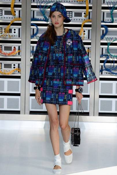
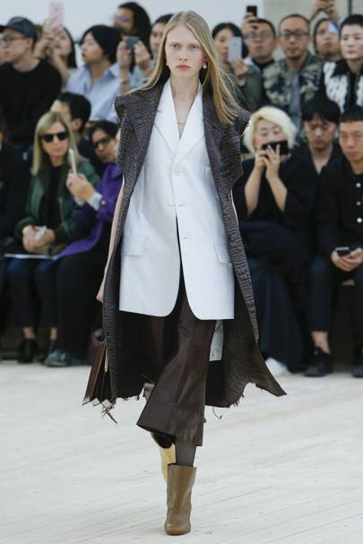
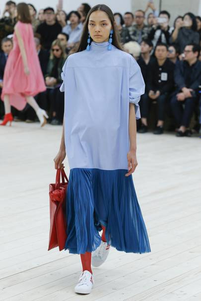
Whilst I was there I was particularly interested in the work of Otobong Nkanga which was called 'The Encounter That Took a Part of Me' and 'The Taste of Stones'. Both parts of the exhibition consisted of large tapestries, wall drawings and installations that traced different areas in botanical and geographical studies, alongside a constellation of various pieces that were from environmental and natural elements of the world. I found these pieces of art very important because in the upcoming weeks I am taking part in a 'Self Promotion project' which looks into different visual ways of promoting ourselves through designs and styles. Therefore, since the exhibitions by Nkanga included a range of graphic and abstract patterns that depicted her own emotions about a subject, I thought these would be great inspiration for when it comes to creating my own diverse prints for my business cards or even taking inspiration for the design of my online portfolio. As a fashion communication student, I definitely feel it is important to start looking at wider backgrounds to capture influence and inspiration for my projects to ensure that my ideas are unique yet filled with imagination and interesting contexts.


Finally, I admired the exhibition by Otobong Nkanga because it translated a relationship between different entities, corruption, ideological shift and power imbalance, which were all depicted through an in-depth composition of contaminated materials and textures to reflect the different turmoil's that had caused the social breakdown. Although none of the work I will be taking part in soon will feature as heavy or intense subjects as this, again, as a creative, I thought it was important to see how different characteristics or problems in society can be depicted through prints, textures and surface materials to communicate a narrative.


The next exhibition I visited in the gallery was 'FOXP2' by Marguerite Humeau. I really liked this exhibition because it allowed me to appreciate the effectivity of merging synthetic voices with sculptures to not only communicate an innovative kind of visual language, but to also show a historical interpretation of the evolution of humans and their formation throughout history.


The exhibition, which displays prototypes of living beings with different degrees of sentience, also taught me of new ways to visual communicate subjects such as biology, psychology and education in a creative and aesthetically pleasing way. Although I am a fashion student, it is very important that I keep up to date with wider contextual references because it is argued that they do have a great impact on the evolvement and the dynamics of trends and also have an effect on consumers behaviour.


Lastly, I liked how the exhibition used a range of different pink hues to create a composition and contrast within the room against the immaculate white elephant sculptures. Again as a creative myself, I enjoyed how this composition enabled the details and the textures of the sculptures to be witnessed and appreciated more, forming new dimensions and volumes within the room. I also liked how the colour scheme and sculptures brought a futuristic, abstract aesthetic to the exhibition which was ironic considering it was based on the evolution of humans and the creation of 'FOXP2' over 100,000 years ago.
SHARE:

Friday 21 October 2016

Nottingham Zine Fest 2016

Over the past weekend I spent my day doing something I love to do; looking through endless amounts of zines and magazines. Located at one of the most individual and idiosyncratic hubs in Nottingham, the Zine Fest took place at record store / cafĂ© / gig venue, Rough Trade. ( If you are yet to visit Rough Trade make sure that you do one day! Especially if you are into old records, aesthetically pleasing coffee table books and collecting edgy band posters.)

Not only did I enjoy the zine festival for my own benefit, but it was also at the top of my do-to list because very soon, on my university course, we will be creating our very own zines under the theme of identity. So what better place to get inspiration from than a fair dedicated to some of the most innovative and artist zines floating around the creative industry that fills the streets and museums of Nottingham right now. The zines were also great inspiration for my upcoming project because I have never actually engaged in such a creative or hands on activity during my previous studies before so I am extremely excited to undergo the process of making and designing my own zine. Furthermore, after taking part in an editorial internship over the summer, I uncovered that it is my dream to one day go down the route of fashion journalism or magazine editorial. Therefore, I intend to get the most experience and understanding of magazines and zines as possible during the upcoming project to ensure I am employable and skilful enough in a variety of areas to ensure my dream can become a reality.

As I walked around the zine festival there were many mini magazines that caught my eye. From quirky self-drawings with fabulous illustrative designs to kitschy patterns exuding delightful compositions and a mixtures of superbly vibrant colours, the festival was a creative and fashion communicators heaven.


One zine that I was particularly drawn in by had been created by a graphic designer called Ben Wood. Although I was not entirely sure about the subject behind his zine until conversing with him, I was mostly intrigued by his unique layout and use of abstraction. Wood's visual communication reflects a design style that I am especially interested in therefore, I could not wait to show his work throughout this blog post. I also admired his taste for contextual and historical references which were mixed with a graphically edgy twist shown especially through his front cover. From what i can interpret myself, I presumed his front cover communicated an image of historical roman or Grecian sculpture which he had redesigned with a feel for animation and illusion, alongside a high contrast and intensely saturated colours.


SHARE:

Friday 14 October 2016

The life of an Intern

Since the beginning of June this year, just after my final hand in for Fashion Communication and Promotion, across the span of three months, I interned in the editorial department of Jules B; an E-Commerce designer brand in the heart of Newcastle. During my internship I gained an array of invaluable skills within areas such as editorial, styling, web sales and buying and merchandising. Not only did the internship provide me with a clearer vision of a real workplace in the fashion industry, but it also allowed me to become a lot more confident within my style of writing, get into a routine of constantly monitoring cultural and fashionable affairs through weekly blogging for the brand and become comfortable with editing the website through visual communication software.

Furthermore, the internship also allowed me to exude my own creative flare through taking part in photoshoots and styling jobs which I believe is extremely beneficial when it comes to the execution part of future projects that I will be taking part in during my second year of university.

Lastly, through working in a high end brand throughout the Spring/Summer season, this also allowed me to gain a more in-depth understanding of how different brands position themselves within the market against competitors, how brands promote seasonal trends and a key understanding of a brand’s consumer and how to maintain their loyalty. Finally, by working within an industry with a variety of viewpoints and attitudes towards fashion, this encouraged me to confidently express my own outlook and aesthetic as a fashion communicator and change my perspective on the creative industry by taking more inspiration from lifestyles, designs and culture which I will be able to utilise within my future studies during my second year of university.

Although this has been quite an in-depth blog post about my roles during my summer internship, thank you for reading and I hope this has encouraged you also to look into gaining experience within the future!!

Kate x
SHARE:

Friday 7 October 2016

Paris Fashion Week 2016

The last of my four part Fashion week series but certainly and most definitely not the least, Paris Fashion Week. Home to some of the greatest desires to have ever graced the world of fashion, this week I will be showcasing looks from legendary fashion houses including Chanel, Celine, Comme Des Garcons and Balengiaca. Visiting Paris Fashion Week is possibly one of the biggest dreams a fashion student can have, however, since i was unable to head over seas this stylish month and grab myself a seat at one of the most innovating and spectacular shows going on in the Parisian city, I have gathered a source of photographs of my favourite looks this season from Vogues fabulously fashionable and impeccably organised archive. To take a look at many of the other shows which have been going on throughout the week, follow this link!

http://www.vogue.co.uk/shows

Chanel


Celine


Comme Des Garcons


Balengiaca

SHARE:
© KATE FERGUSON. All rights reserved.
Blogger Designs by pipdig